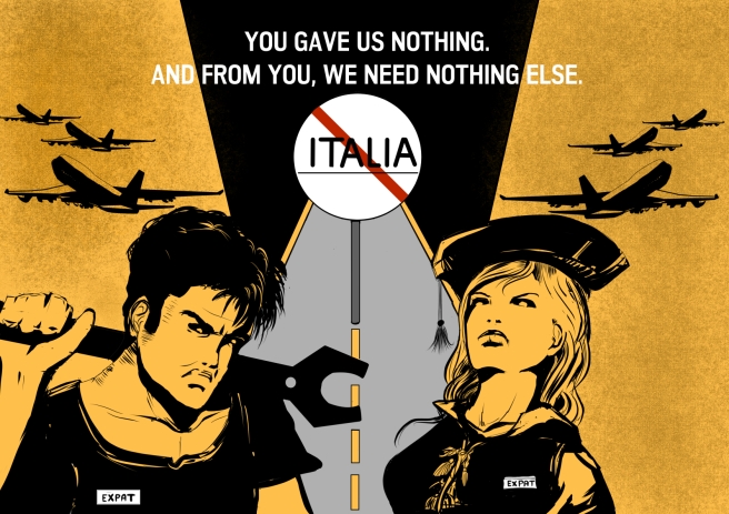

There might be political elections by the beginning of 2018, so I thought that this drawing could also serve as a flyer, spreading a message to the people that a part of the electorate is currently unhappy with youth policies and that, as a consequence, is taking a drastic measure by leaving the country. So for my color choice I wanted bright colors that would catch the viewers eye, and decided I would not use more than 3 colors ( in the end I chose five). I knew for sure that I wanted a color such as a yellow or red for the character’s skin and most of the background. The road would be a light gray and the frame at the top of the post sign black.
In the end I chose yellow because I think it looks much better as a skin tone. Both the characters will have a white tag with the word “expat” written on it. I have mentioned earlier that I wanted to leave the background free of the details as much as possible, but then I thought to add something that would move the viewer’s eye away from the image, giving a sense of departure. Planes seemed just ideal to me. I then continued to refine my characters and the signpost.
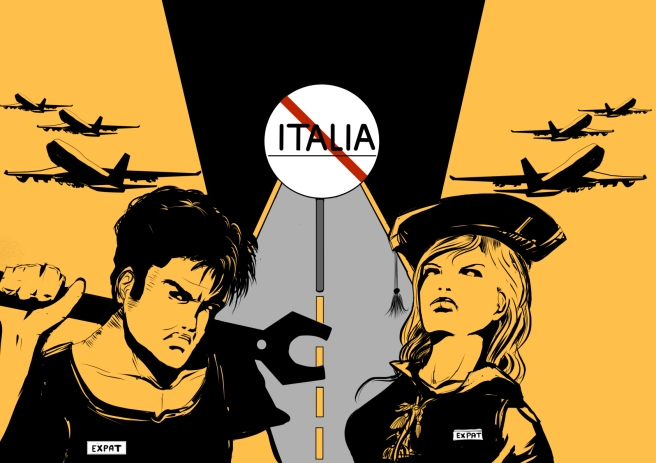
I used a texture effect for the background. For the text, I chose the words “you gave us nothing and from you we need to nothing else”. I had them in mind since the beginning.
The final layout