Exercise: Spider Diagrams

For this exercise I need to create a spider diagram for each of the following words: Seaside, Childhood, Angry, Festival.

I will then test my spider diagram with another person, tick words that are in common, and include the other person’s words using a different color.

I will then reflect on which word I found more difficult to work with and the methods I used to think of more words during the process.

The Spider Diagrams

The keywords in these diagrams are based only on my personal experience. I have not taken any inspiration from external sources.
When I finished, I tested the diagrams with my wife. I have added some of her keywords in red and ticked the words that we shared in common.

The strategy I used for this exercise was to lockdown my mind on every single word, one at a time. I had a musical tune in mind for each word. I thought of things that were related to the words, feelings, objects and moments lived through my life. The word that surprised me was seaside because what came in my mind right away was a fantasy environment with tropical islands and sirens. My mind was locked to that environment, so I went for it and wrote down the keywords. “Angry” was the word my wife and I found the most difficult. I think it’s because adjectives are hard to describe. I related the word “angry” with drawing, because its what I often do when I feel that way.

I noted that my wife’s spider diagrams expressed more feelings, with an overall sense of happiness and love.

Final Thoughts

I really like this method for organizing keywords. Before starting this course, I used to brainstorm and write keywords in a messy way, with no structure. With this method keywords are better organized. For example, before starting this course  I didn’t write a main keyword and then child keywords. I would write the words “tree” and “leaves” separately, while instead “leaves” can be seen as a child keyword of “tree”. This leads to a better organization. I also found interesting the “joint brainstorm”. In the case of the word “festival”, for example, the keyword “fireworks” chosen by my wife sparked an alternative idea on how I could illustrate a festival.

The idea

I´ve been watching many westerns lately, including masterpiece from Quentin Tarantino “The Hateful Eight”, which I have enjoyed in 70mm.
So as soon as I read this assignment I knew that I would draw myself as a sheriff, showing my lawful personality and passion for the Western movie genre.
And besides the passion for cinema, I also love to draw.
I wanted my character inside a simple frame with no background, so that the viewer’s eye would remain focused on the character.
My first idea was to replace traditional guns with  more peaceful pens and brushes and I wanted to include both elements of traditional and digital drawing. At this point I started sketching the body frame and used the head as a measuring unit to make sure that proportions were right.avaneosketch
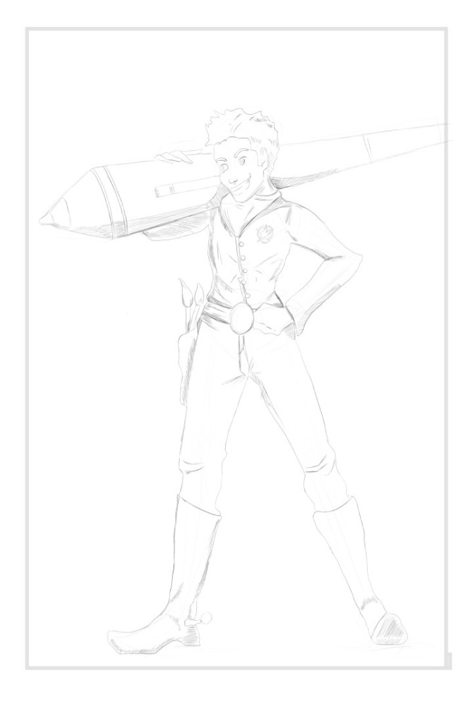
My character’s first tool of the trade is a digital pen, which I have drawn in exaggerated proportions, followed by a couple of brushes as elements of traditional drawing inside the gun holster. I continued penciling some more details, then I moved on to the inking stage.
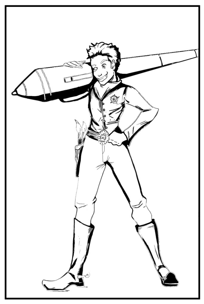
 

The final pencils.
avaneo1pencils

Inks

avaneoinks

The colors and final layout

For the clothing, I was inspired by the most famous Italian comic character Tex Willer (created in 1948). He has blue pants and yellow shirt in the comic covers, but in the first episodes his shirt was red. I always preferred him in red, so I chose this color. As for the pen, I opted for the realistic colors black and gray.

At this point I felt that the rectangular frame was a little too simple so I added a semi circle shape at the top. And since my tutor is an artist, I decided to greet her with the words “Greetings, fellow artist”.

Final Layout

avaneofinal

Final Reflections

This was the drawings that I had in mind since the beginning. I am overall satisfied with the final outcome and I think that the illustration represents me well.

The character is a cartoon and I am not confident with cartoon characters. However I believe that, in order to be a well-rounded artist, it is always important to try new things. I wasn’t sure if leaving the background blank was a good idea or no. So I went out and looked at the greeting cards sold in bookshops and the noticed that many of them had no background. So I guess it really depends on what you want to tell the audience.