The Idea

The illustration I chose for this exercise is the cover of the fourth installment of the popular game series Far Cry. The reason is simple. It has been one of the rare cases in which I have bought an entertainment product based only on the front cover, meaning that the illustration succeeded in convincing me to buy the game. I couldn’t find information on who made this illustration, so since I cannot give him credit for the work, I will just give a link to the image.

http://bit.ly/2qK8WwB


The same illustration has also been used as the final image of the game’s trailer combined with the vocal message “Welcome to Kyrat”. Having played the previous installments, I was very intrigued by this new antagonist character dressed in pink. I am also thrilled in writing a brief about what I consider to be one of the best scripted villain in a game. The cover generated debates over the internet, with some pointing out that the artwork depicts racism.

Writing the brief

Before starting, the illustrator should have some background about what the far cry series is about. He should also have access to the current story’s plot and concept art.

The brief is the following:

  • The illustration will be used for the game’s front cover and the trailer. The trailer will  end with this illustration and the vocal message “Welcome to Kyrat”. Kyrat is a fictional land similar to Nepal.
  •    The cover has marketing purposes. The cover has to be one of the key elements for purchase.
  •     The target audience are adults over 18.
  •   The image must include the main antagonist Pagan Min.
  •    There will be no text, except for the title at the top center of the image.
  •     Characters, objects and environments should be drawn realistically to show the power of the    game’s graphical engine.
  •  The players might be new to the series. Include elements that give a clear picture of what the game is about.
  •  The viewer’s eye should be focused on the main antagonist, Pagan Min. I suggest drawing him at the center of the picture. Make sure to use vibrant tones for his suit and hair. Refer to the color palette of the concept art.
  •  Pagan Min is a king and tyrant of Kyrat. Depict him as such in the illustration. He is not a pure evil character but has instead a mysterious personality.  He is a “gray” character. He also has an extravagant personality and erratic behaviors.
  •  Objects and environments should be secondary to the illustration and give clues of where the game takes place and what the game is about.

My analysis of the illustration

“You know, the one and only time I walked in to this place, I walked in a sane man and came out…like this” – Pagan Min


Having played the game, I can say that the visuals describe the villain very well. Due to the extensive use of the bright pink colors, my first look is always for him. Other brighter colors include the yellow armband on the kneeling man, the green rocket, the green vegetation of the mountains on the left and the clear blue sky at the top. I feel like my eyes move in circle around the picture, allowing me to see all the key elements. The weapons are positioned in a strategic way, pointing towards the villain. The foreground ground uses a mix of grey and brown colors and do not distract the eye. The way the villain sits on his throne shows that he is the king of the land. His facial expression and his hand over the head of a subdued man add hints to his mad personality . By better examining the image for this exercise, I have noticed that Pagan Min is holding the grenade’s safety ring with his finger. A nice detail.

Final reflections

What went well

This exercise has been very educational. It was not the first time that I have created a brief, but I didn’t know WHY I was creating it. I just used  to write it down a series of keywords knowing that they were useful for the final result. My briefs were also very basic and didn’t include some of the possible requests outlined by this exercise.It’s a process that has always been instinctive for me, and I am glad to see that I was on the right track.

What went wrong

I cannot find anything at the moment that really didn’t work out for this exercise.

Exercise: Getting the gist

The task for this exercise is to read a newspaper article (I chose one from an online magazine) and underline keywords that convey the meaning of the article. Then, I will read the article again, focusing on the selected keywords, and condensing the ones that I find more meaningful.

These chosen keywords will be the starting point for creating a related illustration.

Article Analysis

A few mornings ago I was reading the online news, and focused on a few articles about the disastrous political situation of my home country. While reading the comments, I began following a debate about young Italians leaving the country due to the current unstable conditions, and decided to google the topic. I stumbled upon an article, and after reading it, I was inspired and chose it for my illustration task.

The article is in Italian, but I have translated the overall meaning of the piece.

The analysis can be found here:

Article – The Youth Migration

I have condensed the keywords together and arranged four sentences. I will rewrite them here.

– chi parte oggi non tornerà in assenza di nuove opportunità. Esiste un mondo giovanile in movimento che il paese non riesce più a intercettare. l’Italia non è più attrattiva per gli italiani. Esportiamo giovani e laureati. –

Translated:

People leaving will not return unless better opportunities arise. There is a youth migration that the country is not able to intercept. Italy is not appealing for Italians anymore. We export young and highly educated people.

I was so inspired by the article that I began sketching my idea right away. I had everything in mind. However, I also wanted to add my personal feelings to this piece and added a key sentence .

  1. Anger  and distrust towards all Italian political parties.

With the keywords in place, it was time to move to the drawing board.
Preliminary sketch and inks

I had the scene framed in my mind so I did a quick sketch. I always start all my drawings like this, trying to roughly place all the characters, objects and important details in a scene so that I avoid the risk of forgetting something. Once this is done, I relax a moment and think where to move next.

ex2sketch


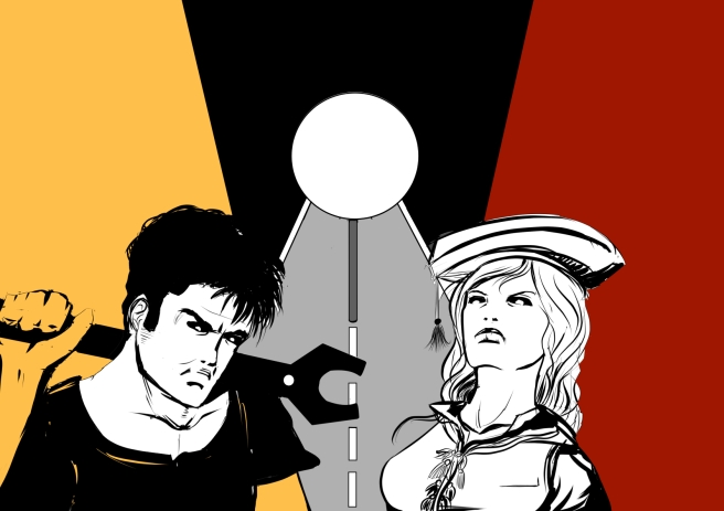
I wanted the two main characters in the foreground and at the center of the scene. I chose a manual worker and a highly educated character of different sex because both have the same importance  in society. I decided that the background should have as little details as possible to avoid distractions from the two characters. The central part of the scene depicts a road in perspective with the Italian border sign in the middle. The text will go on the upper middle part of the scene, above the post sign. I will not continue penciling and move directly to inking, because the characters will not be particularly detailed.


ex2ink


I blocked in the main details. At this point, I realized that his arm and hand are wrong and will provide to correct them later. My male character has a more menacing pose, showing more anger. I wanted to depict him as a hard worker from the way he keeps his heavy wrench on the shoulder. The State lost a valuable working resource. My female character is highly educated. I tried to depict her angry and proud of her accomplishments, by drawing her in an erect posture and chin up. I think this picture represents well a part of the Italian youth.


Color Choice and Details

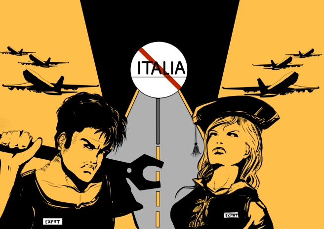
There might be political elections by the beginning of 2018, so I thought that this drawing could also serve as a flyer, spreading a message to the people that a part of the electorate is currently unhappy with youth policies and that, as a consequence, is taking a drastic measure by leaving the country.  So for my color choice I wanted bright colors that would catch the viewers eye, and decided I would not use more than 3 colors ( in the end I chose five). I knew for sure that I wanted a color such as a yellow or red for the character’s skin and most of the background. The road would be a light gray and the frame at the top of the post sign black.

excolors1

In the end I chose yellow because I think it looks much better as a skin tone. Both the characters will have a white tag with the word “expat” written on it. I have mentioned earlier that I wanted to leave the background free of the details as much as possible, but then I thought to add something that would move the viewer’s  eye away from the image, giving a sense of departure.  Planes seemed  just ideal to me. I then continued to refine my characters and the signpost.

ex2colors2

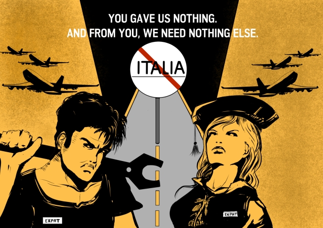
I used a texture effect for the background. For the text, I chose the words “you gave us nothing and from you we need to nothing else”. I had them in mind since the beginning.

The final layout


EX2 FINAL


Final reflections

What went well

  • I am overall very satisfied about the final outcome. I have transferred an image from my mind into a visual medium and being able to do so is always a great accomplishment for me.
  • I transferred my feelings into this image and made me feel better. This is an example, for me, of art as a therapy.
  • I am satisfied with my character creation, with the girl in particular.


What went wrong

  • I was so focused in working with what I had in mind that I forgot to think about other ideas as well. Unless multiple ideas strike at the same time, I find thinking of alternate ideas a mechanical process that breaks down the flow of my current inspiration. However, I do realize that comparing different ideas can be beneficial for the final outcome and so I will keep this in mind for future work.