Exercise: Getting the gist

The task for this exercise is to read a newspaper article (I chose one from an online magazine) and underline keywords that convey the meaning of the article. Then, I will read the article again, focusing on the selected keywords, and condensing the ones that I find more meaningful.

These chosen keywords will be the starting point for creating a related illustration.

Article Analysis

A few mornings ago I was reading the online news, and focused on a few articles about the disastrous political situation of my home country. While reading the comments, I began following a debate about young Italians leaving the country due to the current unstable conditions, and decided to google the topic. I stumbled upon an article, and after reading it, I was inspired and chose it for my illustration task.

The article is in Italian, but I have translated the overall meaning of the piece.

The analysis can be found here:

Article – The Youth Migration

I have condensed the keywords together and arranged four sentences. I will rewrite them here.

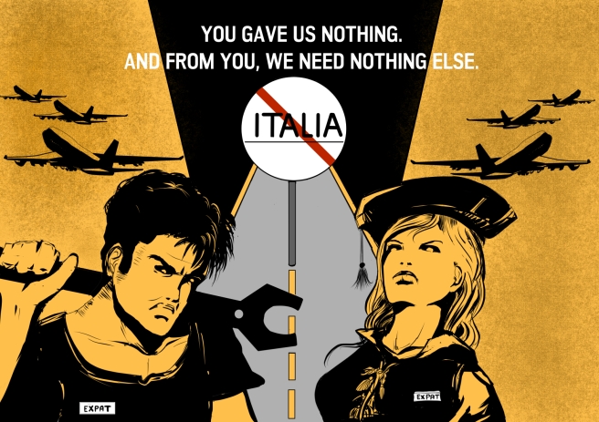
– chi parte oggi non tornerà in assenza di nuove opportunità. Esiste un mondo giovanile in movimento che il paese non riesce più a intercettare. l’Italia non è più attrattiva per gli italiani. Esportiamo giovani e laureati. –

Translated:

People leaving will not return unless better opportunities arise. There is a youth migration that the country is not able to intercept. Italy is not appealing for Italians anymore. We export young and highly educated people.

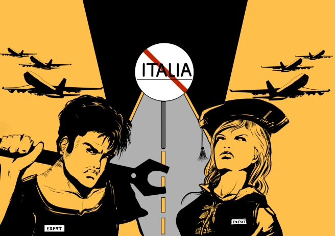
I was so inspired by the article that I began sketching my idea right away. I had everything in mind. However, I also wanted to add my personal feelings to this piece and added a key sentence .

  1. Anger  and distrust towards all Italian political parties.

With the keywords in place, it was time to move to the drawing board.

Preliminary sketch and inks

I had the scene framed in my mind so I did a quick sketch. I always start all my drawings like this, trying to roughly place all the characters, objects and important details in a scene so that I avoid the risk of forgetting something. Once this is done, I relax a moment and think where to move next.

ex2sketch


I wanted the two main characters in the foreground and at the center of the scene. I chose a manual worker and a highly educated character of different sex because both have the same importance  in society. I decided that the background should have as little details as possible to avoid distractions from the two characters. The central part of the scene depicts a road in perspective with the Italian border sign in the middle. The text will go on the upper middle part of the scene, above the post sign. I will not continue penciling and move directly to inking, because the characters will not be particularly detailed.


ex2ink


I blocked in the main details. At this point, I realized that his arm and hand are wrong and will provide to correct them later. My male character has a more menacing pose, showing more anger. I wanted to depict him as a hard worker from the way he keeps his heavy wrench on the shoulder. The State lost a valuable working resource. My female character is highly educated. I tried to depict her angry and proud of her accomplishments, by drawing her in an erect posture and chin up. I think this picture represents well a part of the Italian youth.


Color Choice and Details

There might be political elections by the beginning of 2018, so I thought that this drawing could also serve as a flyer, spreading a message to the people that a part of the electorate is currently unhappy with youth policies and that, as a consequence, is taking a drastic measure by leaving the country.  So for my color choice I wanted bright colors that would catch the viewers eye, and decided I would not use more than 3 colors ( in the end I chose five). I knew for sure that I wanted a color such as a yellow or red for the character’s skin and most of the background. The road would be a light gray and the frame at the top of the post sign black.

excolors1

In the end I chose yellow because I think it looks much better as a skin tone. Both the characters will have a white tag with the word “expat” written on it. I have mentioned earlier that I wanted to leave the background free of the details as much as possible, but then I thought to add something that would move the viewer’s  eye away from the image, giving a sense of departure.  Planes seemed  just ideal to me. I then continued to refine my characters and the signpost.

ex2colors2

I used a texture effect for the background. For the text, I chose the words “you gave us nothing and from you we need to nothing else”. I had them in mind since the beginning.

The final layout


EX2 FINAL


Final reflections

What went well

  • I am overall very satisfied about the final outcome. I have transferred an image from my mind into a visual medium and being able to do so is always a great accomplishment for me.
  • I transferred my feelings into this image and made me feel better. This is an example, for me, of art as a therapy.
  • I am satisfied with my character creation, with the girl in particular.


What went wrong

  • I was so focused in working with what I had in mind that I forgot to think about other ideas as well. Unless multiple ideas strike at the same time, I find thinking of alternate ideas a mechanical process that breaks down the flow of my current inspiration. However, I do realize that comparing different ideas can be beneficial for the final outcome and so I will keep this in mind for future work.

Exercise: The history of illustration

In this first exercise of the course I have been asked to do so some research about the work of past and contemporary artists, and to reflect on how the field of illustration has changed over the past 50 years.

I will choose one from a list of illustrators and analyze some of the work that I like more and  then make a comparison in style and historical context with a contemporary illustrator that I like.

I will reflect on the following questions:

  • Do I think that the work of the chosen illustrator is old-fashioned? If yes, what are the key elements that make it look so?
  • What elements of my chosen contemporary artist attracted me?
  • How did each artist produce their illustrations? What materials did they use?

I will then create an illustration in the style of each artist.

Method of Approach

  • Read about the six illustrators, and make a diagram containing keywords related to their life and work.
  • Choose the one I prefer and explain why
  • Choose a contemporary illustrator I like and make a comparison in style and materials used. Comment the two styles.
  • Draw two illustrations in a similar style of the two illustrators

Research

I knew none of the six illustrators,So I went on reading their biography and checking their work.For each illustrator I made a diagram on a piece of paper with related keywords. I use this method when brainstorming and I read that in this course there is a similar method called spiderweb.

This is the outcome

DSC_0230.JPG

I chose John Minton because I really like his moody atmosphere,line drawing and  way of expressing feelings. I, like him, feel also uncomfortable towards abstract art. John Minton used mainly watercolor and ink for his art.
DSC_0005.JPG
Two of his pieces I liked
                                 John Minton portrait and Jamaican Scene (1952)
The self portrait shows great care in the color palette and attention to details. The brown and grey tones of the face contrast well with the lightly brighter colors of the shirt.  I particularly like the ear, a part of the human body which is sometimes neglected in artistic work. The painting is also expressing feelings. In the Jamaican Scene, I like the careful hatching and simple but effective composition. Based on the perspective positioning of the palm tree, the viewers standing point is very close to the first canoe and possibly on land. The canoe in the back is rendered as a silhouette with little to no details to make it understandable that it is located in the background.

My Chosen Artist and Comparison

An artist I began following recently is Marcelo Frusin, from Argentina. He cooperated with writer Brian Azzarello in the creation of the western comic book series “Loveless”. Unfortunately there is not much material about Frusin, but I really like his style. He relies intensively on black tones and silhouette figures, creating a very good atmosphere without excessive details. When I discovered him, I had a western plot that I was scriptwriting and wanted to try a more simple style with a major focus on mood. One of my weak spots is confidence in lights and shadows, and I think that following his style is helping me.


“Loveless” issue n.1, cover by Marcelo Frusin,2005. “Time was away”, cover by John Minton, 1948.

There are many differences between these two book covers. In Frusins illustration emphasis is on drama and action. These can be especially noted in the foreshortening of the gun,the facial expression of the main character and in the movement of the three gunmen. The sentence “Behind every bad man is a badder woman” adds a sense of mistery to the red silhouette of the woman in the background. This illustration has been created in digital. On the other hand, Minton’s cover gives a sense of a peaceful atmosphere.The colors are warm and the values are only rendered in black. A series of lines in the sky, together with the highlights on the sea, give the impression of a sunny day. I do not find Minton’s cover particularly old-fashioned, except maybe from the text font, and I think that this illustration could be suited for a modern travel book. I think he used watercolors and ink, but I’m not sure since I still don’t have a good background of traditional medium.

Drawing my illustrations: illustration 1

I will draw two illustrations, one in black and white and one in color.

I will take inspiration from John Minton’s Jamaican Scene to draw a tropical island. It will be a night scene. I will use hatching for the clouds, in order to give a more greyish color, and for the sea. This will be something new for me, as I never use ink hatching for the sky, so i look forward for the result. My visual goal is to create an approaching storm and windy weather.

So the first thing I will do is to sketch down the scene. Like many pencillers, I use an “X” to mark areas that need to be filled in black. I will also write down some notes as reminders. I will not go in details with pencils as much of the scene will be filled in black.

p1

I framed the image a little higher to have more space for the sky. I then started inking the contours of the palm trees and the clouds, leaving the sky for last.

I started working on the details for the trees and the vegetation on the beach. I use white strokes to define the tree trunks and the highlights.
This has been a lengthy but very enjoyable process. I then inked the sky and used small white dots to create the stars.

The final layout.